PADAC™ (People, Art, Design, & Culture), a free digital archive that documents & magnifies innovators, pioneers, and creative visionaries who have greatly influenced, music, literature, art, design, and the performing arts.
PADAC™
Brand Identity | Ongoing Project
Software Used: Adobe After Effects, Adobe Illustrator, Adobe Photoshop, Adobe Premier Pro
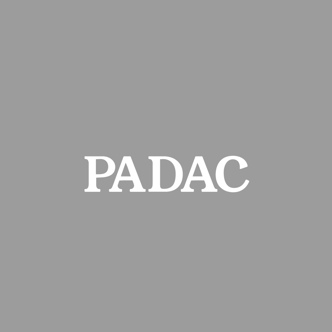
Wordmark
The PADAC™ Wordmark is a combination of the typefaces Aktiv Grotesk Condensed and Amador.
The gothic letter forms of Amador replace the "P & A" in Aktiv Grotesk Condensed Medium.
__
Images on your right provide inspiration examples and discarded logo Iterations. The wordmark draws inspiration from both the publications of the Philadelphia newspaper Inquire and the distinctive wordmarks of The Crisis Magazine, which was established in 1910.

Inspo Clippings
Established in 1910 by W. E. B. Du Bois, The Crisis Magazine addresses race and interracial relations, providing a platform for African-American commentary. It aims to promote the dream of human brotherhood and often features contributions from prominent literary scholars and artists of the time.
Discarded Logo iterations
Some examples of Logo iterations created during the design process experimented with lowercase, italic, bold, and stacked letterforms.

The Wordmark is presented against the brand’s primary colors, as well as black & white.
The gothic “P” can be used for social profile images.


Example of a social profile image for Instagram.
The primary colors consist of a bright purple & a golden yellow; the pallet features a range of secondary colors, paired with a neutral color palette.
Color

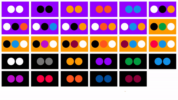
As the brand develops, there is room for the creation of patterns. The image above shows the possibilities of possible color combinations/interactions.
Wordmark + Motion Identities
The Wordmark can be animated into multiple motion identities. These are examples of the Wordmark animated on top of selected secondary colors.
The decision to implement a randomized & varied motion design system for the People, Art, Design, & Culture Art Design Archive is driven by the commitment to reflect the diversity and dynamism inherent in BIPOC voices in art, design, and the performing arts.
By incorporating randomization into the motion design system, PADAC™ seeks to capture the rich tapestry of experiences, perspectives, and expressions within these communities.


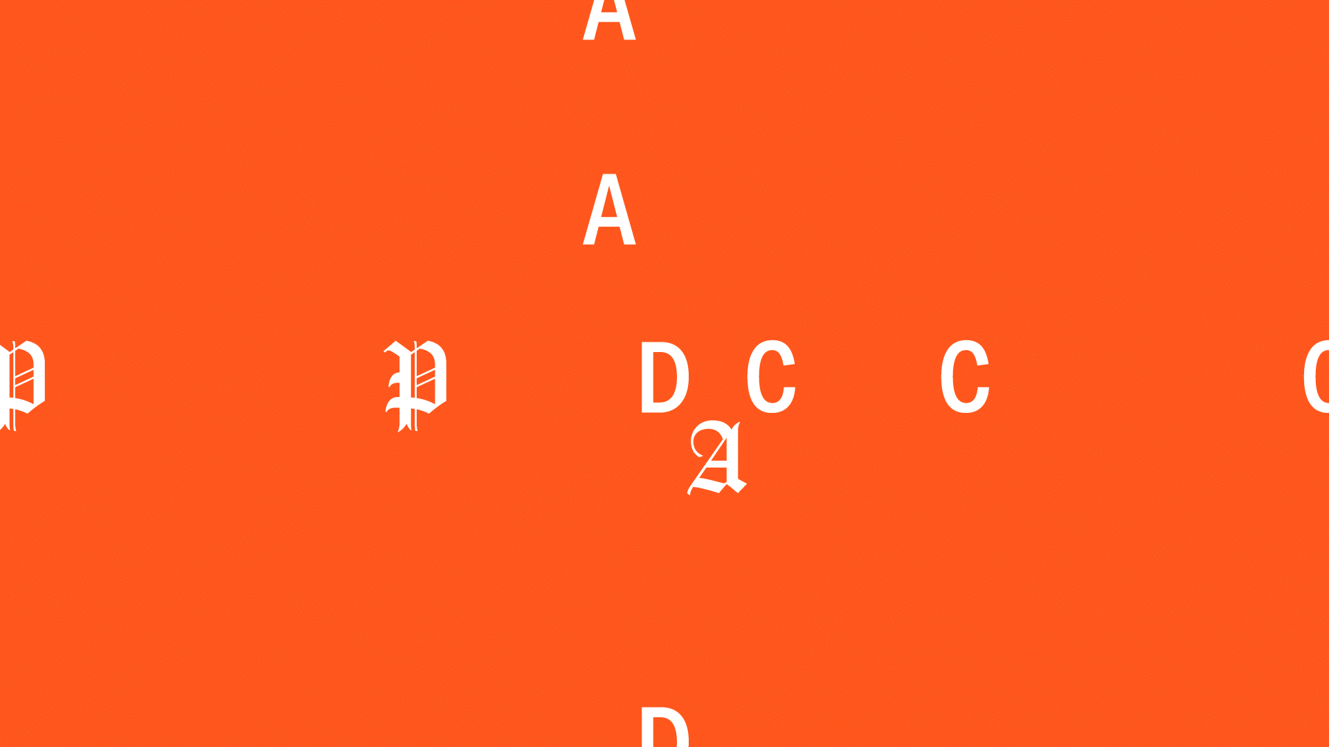

An example of a grid used to create one of the motion identity variations. Occasionally, the Wordmark follows the grid, while at other moments the Wordmark breaks it.


The animated Wordmark can seamlessly integrate into videos and images to create Instagram stories and other social media posts.
Social Media Posts
Example of animated Wordmark on top of imagery in 1920x1080 format.
Type In Use
The primary typeface is Elza, it has sleek & strong geometric features that pair well with the Wordmark.


The motion identity system can be applied by translating it onto the primary typeface and overlaying it on top of color and imagery.
Kinetic type/motion identity system shown on top of black & grey background.
Examples of the motion identity system translated to social media posts.

While the PADAC™ brand identity is commonly employed in the digital space, here are examples of how the logo would be transferred to business cards and a single letterhead.